




























Infographic Elements and Charts

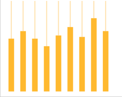
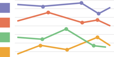
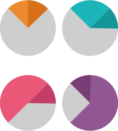
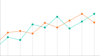
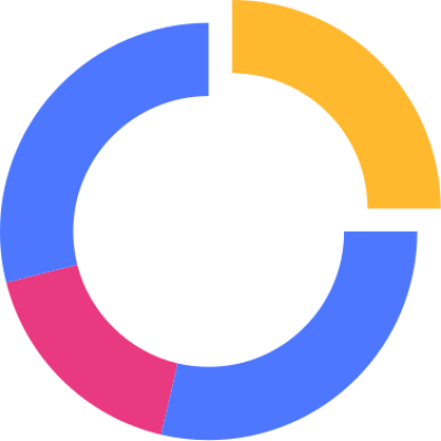
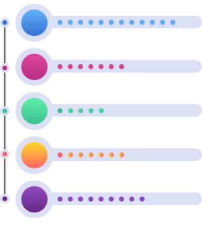
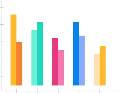
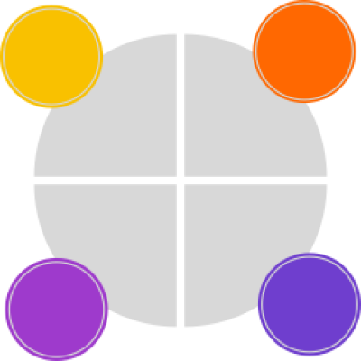
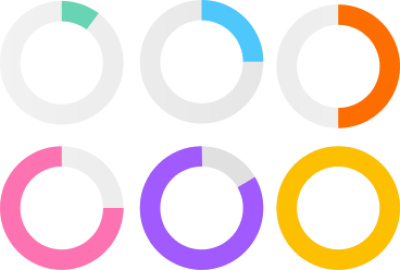
Build an Arabic infographic from ready elements: percentage rings, bar and line charts and numbered steps on a transparent background you recolour and relabel.

Start designing
مخطوطة مخطوطات
مخطوطة مخطوطات
مخطوطة مخطوطات
مخطوطة مخطوطات
مخطوطة مخطوطات
مخطوطة مخطوطات
مخطوطة مخطوطات
مخطوطة مخطوطات
مخطوطة مخطوطات
مخطوطة مخطوطات
مخطوطة مخطوطات
مخطوطة مخطوطات
مخطوطة مخطوطات
مخطوطة مخطوطات
مخطوطة مخطوطات
مخطوطة مخطوطات
مخطوطة مخطوطات
مخطوطة مخطوطات
مخطوطة مخطوطات
مخطوطة مخطوطات
مخطوطة مخطوطات
مخطوطة مخطوطات
مخطوطة مخطوطات
مخطوطة مخطوطات
مخطوطة مخطوطات
مخطوطة مخطوطات
مخطوطة مخطوطات
مخطوطة مخطوطات
مخطوطة مخطوطات
مخطوطة مخطوطات
مخطوطة مخطوطات
مخطوطة مخطوطات
مخطوطة مخطوطات
مخطوطة مخطوطات
مخطوطة مخطوطات
مخطوطة مخطوطات
مخطوطة مخطوطات
مخطوطة مخطوطات
مخطوطة مخطوطات
مخطوطة مخطوطات
مخطوطة مخطوطات
مخطوطة مخطوطات
مخطوطة مخطوطات

Infographic Elements and Charts

What makes an infographic readable at a glance?
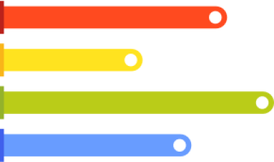
One prominent number per element and one shape to represent it. A ring suits proportions, bars suit comparison between items, a line suits change over time and numbered steps suit a sequence. Choosing the wrong shape turns the graphic into decoration rather than information.

What can you design?

  • Percentage rings and comparison bars

  • Line charts for figures over time

  • Numbered steps explaining a process

  • Teaching infographics and school handouts

  • Reports and statistics posts for companies

How many colours does one infographic take?
Three or four at most, and each colour keeps one fixed meaning throughout. The colour that means highest in the ring must mean the same in the bars, otherwise the reader rereads the key at every element.

الأسئلة الشائعة

Are the elements editable?
Yes. Adjust each element's size and colour inside Andalusi and add your own numbers and labels in an Arabic font, so the infographic carries your data rather than placeholder figures.
Pie chart or bar chart?
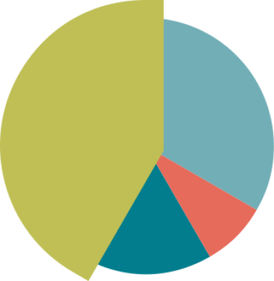
Pie for parts of one whole, and no more than four slices; bar for comparing separate values. Past four slices a pie's wedges get too close in size to tell apart.
Do these suit presentations?
Yes. They suit slides, reports and educational posts, and exporting at high quality from Andalusi keeps the figures sharp on a large screen.