Social Media Post Templates in Arabic

Design a post at the right size for each platform. Editable Instagram, Facebook and X layouts with proper Arabic right to left type.

Start designing

Page 16 of 17

Social Media Post Templates

How do you design a post for your accounts?
Pick a post template at the size you need, change the text, image and colours, then export it ready to publish on Instagram, Facebook or X. The templates are built for Arabic running right to left, which is where most generic template tools fall down.

What can you design?

  • Square Instagram posts and Facebook posts

  • Product, offer and discount announcements

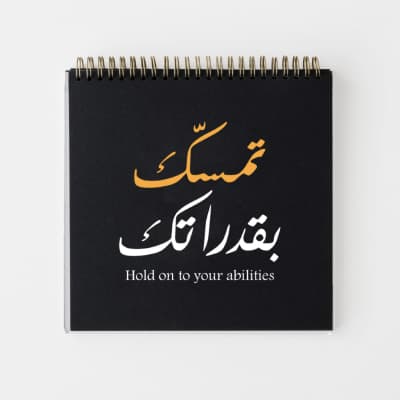
  • Text posts and phrases in elegant Arabic type

  • Multi-slide carousels published as one series

  • Covers and profile pictures matching your account identity

  • Blank layouts you fill in entirely yourself

How do you keep one identity across your posts?
Start from a ready template, then fix your brand colours, your logo and one preferred typeface from the Andalusi Arabic font library. A visually consistent account is recognised mid-scroll, before the name is read.

الأسئلة الشائعة

What is the correct post size?
The square at 1080 by 1080 pixels is the most used and works everywhere, while the 4:5 vertical takes more room in the feed and so gets seen more. Avoid wide formats in-feed, where they appear small. Design square if you will publish across several platforms. Andalusi's post templates are built at these sizes.
What is the structure of a good post?
One element that catches the eye first, then a line explaining it, then a single detail such as the price or the time, then one call to action. A post carrying two messages delivers neither. Read yours at small size on a phone before publishing, since what cannot be read there is not read at all. Andalusi's templates are built to that order.
How much text should a post carry?
Five to fifteen words inside the design, with anything more going in the caption rather than on the image. The rule is that a post should be understood in two seconds without being read in full. Use two text sizes only: a large heading and a smaller line. Andalusi's templates mark the text areas that show you the sensible limit.
How do I make my posts look consistent in the profile grid?
Look at the account as a grid rather than as separate posts: spread the colours so three posts of one colour do not sit together, fix the logo position, and alternate between image posts and text posts. The grid is the first thing a visitor sees, before reading any single post. Andalusi stores an identity applied across every design.