


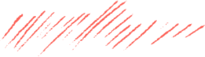
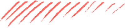


















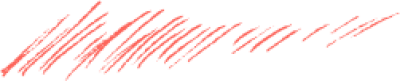
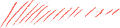











Brush Underlines for Emphasising Words

Add brush underlines to your designs: thin strokes with uneven edges on transparent backgrounds that run beneath a word to lift it without recolouring it.

Start designing
مخطوطة مخطوطات
مخطوطة مخطوطات
مخطوطة مخطوطات
مخطوطة مخطوطات
مخطوطة مخطوطات
مخطوطة مخطوطات
مخطوطة مخطوطات
مخطوطة مخطوطات
مخطوطة مخطوطات
مخطوطة مخطوطات
مخطوطة مخطوطات
مخطوطة مخطوطات
مخطوطة مخطوطات
مخطوطة مخطوطات
مخطوطة مخطوطات
مخطوطة مخطوطات
مخطوطة مخطوطات
مخطوطة مخطوطات
مخطوطة مخطوطات
مخطوطة مخطوطات
مخطوطة مخطوطات
مخطوطة مخطوطات
مخطوطة مخطوطات
مخطوطة مخطوطات
مخطوطة مخطوطات
مخطوطة مخطوطات
مخطوطة مخطوطات
مخطوطة مخطوطات
مخطوطة مخطوطات
مخطوطة مخطوطات
مخطوطة مخطوطات
مخطوطة مخطوطات
مخطوطة مخطوطات
مخطوطة مخطوطات
مخطوطة مخطوطات
مخطوطة مخطوطات

Brush Strokes for Emphasis

Why underline a word with a brush stroke?
Because it is the quietest way to emphasise: the word stands out without growing, changing colour, or turning bold. A hand-drawn stroke beneath it tells the eye this is the important part while the type stays one weight throughout.

What can you design with them?

  • Marking one word in a heading

  • Rules beneath subheadings

  • Emphasising prices and figures

  • Posts in a handmade style

  • Striking through words in before and after comparisons

How many words should you underline?
One. Emphasis is a way of choosing, so underlining three words means none of them is chosen. Pick the word that would carry the message on its own, and mark only that.

الأسئلة الشائعة

How do these differ from the paint strokes?
Brush underlines are thin and long and run beneath text to mark it, while paint strokes are broad and thick and sit behind text as a colour bed. One marks; the other fills.
Can I change a stroke's colour?
Yes. Adjust each stroke's colour inside Andalusi to match your brand or contrast with the text. Contrast reads better, since a stroke in the text's own colour barely registers.
Where exactly does the stroke go?
A small gap below the letters rather than touching them, and slightly wider than the word at both ends. A stroke shorter than the word looks unfinished, and one touching it looks like a typo.