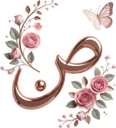










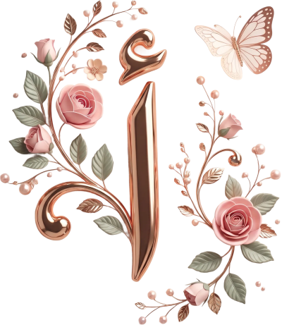
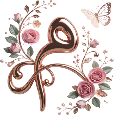


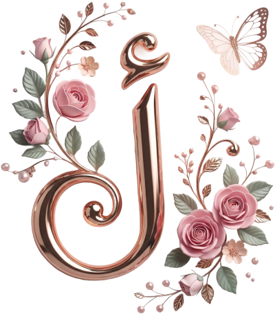



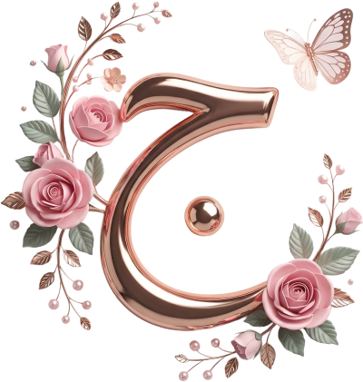
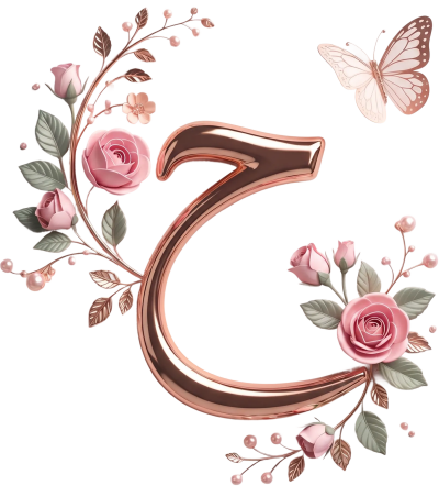



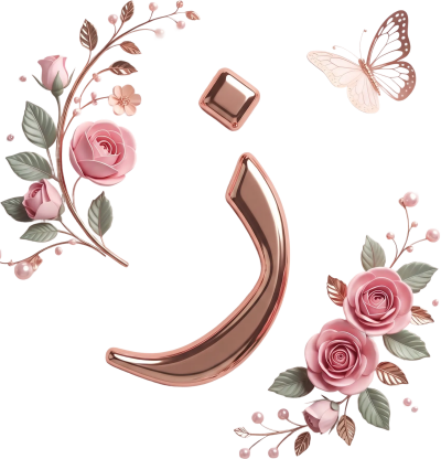


























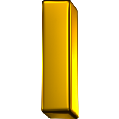












Add gold letters to your designs: metallic Arabic characters and numerals on transparent backgrounds for luxury invitations, logos and cards.
Start designingWhy does a gold letter read as luxurious?
Because it carries a gradient rather than a flat colour: light where the light falls, dark in shadow, which suggests a metal surface instead of ink. That is why gold letters work far better on dark backgrounds than on white.
What can you design with them?
Luxury invitations and occasion cards
Names and monograms in gold lettering
Logos and stamps with a refined feel
Year, age and anniversary numerals
Standout headings for covers and posts
What background should gold letters sit on?
Set them on a deep dark tone such as navy, black or olive, because the contrast is what reveals the gradient's shine. On light backgrounds gold loses its lustre and reads as dull brown; if you must, add a soft shadow behind the letter.